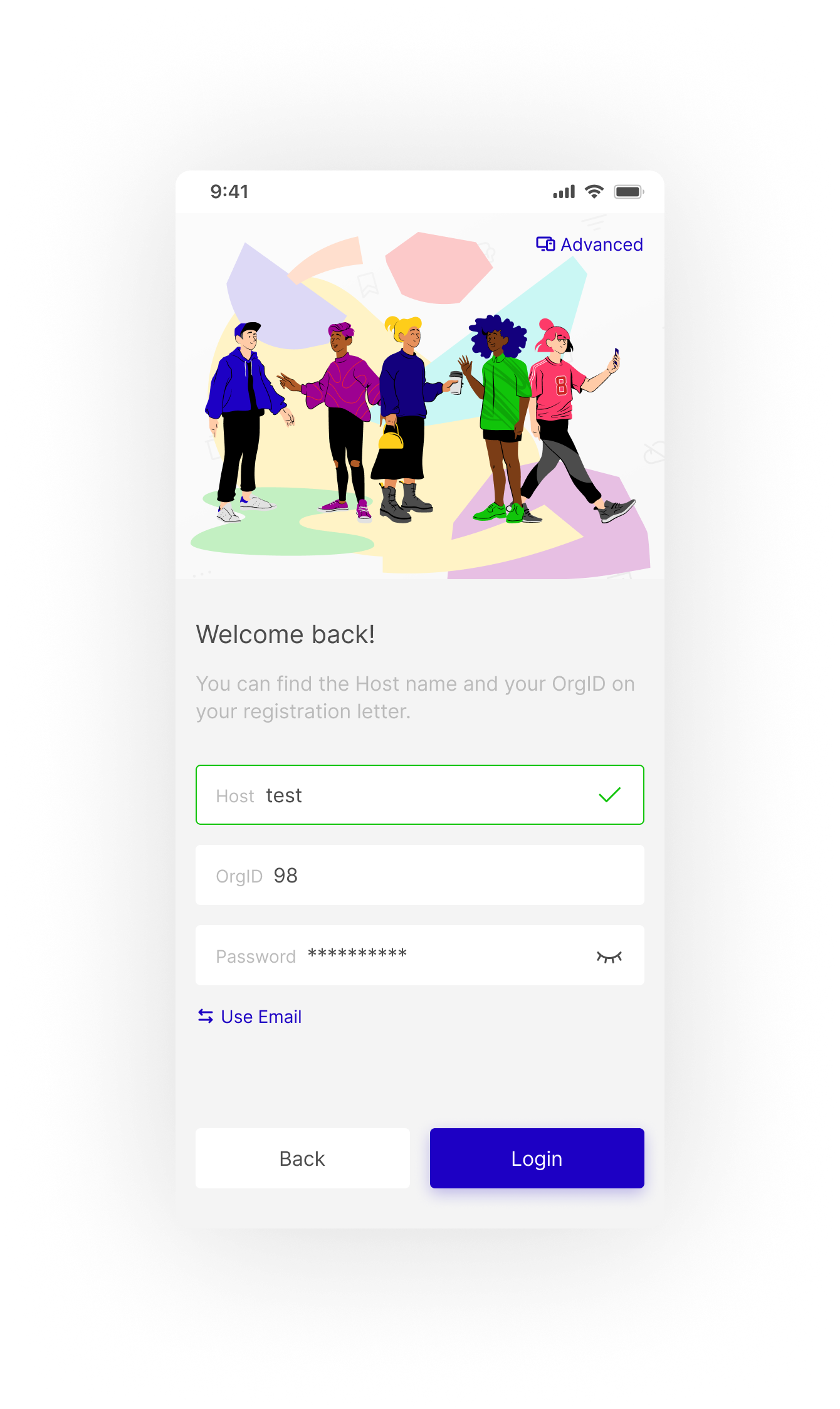
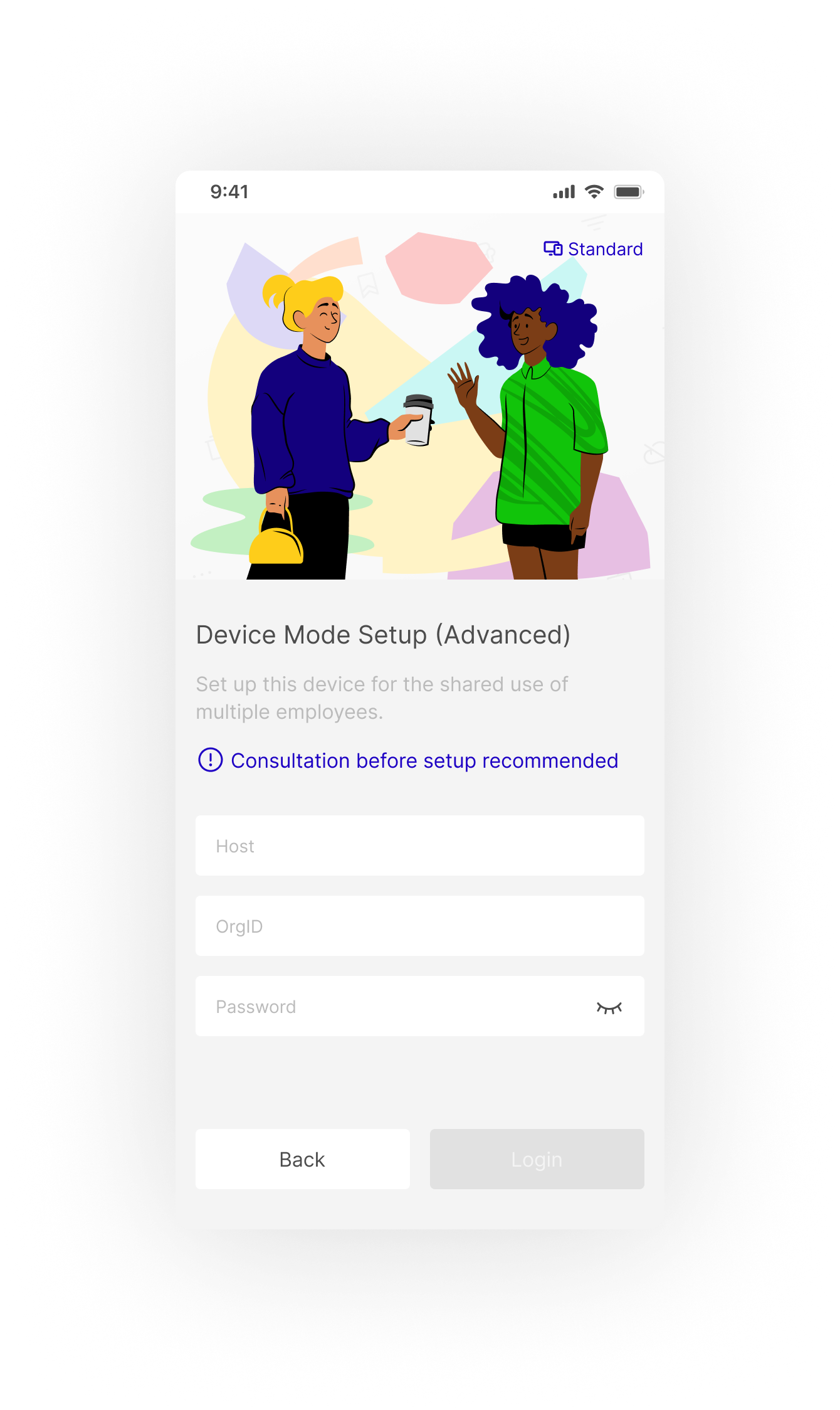
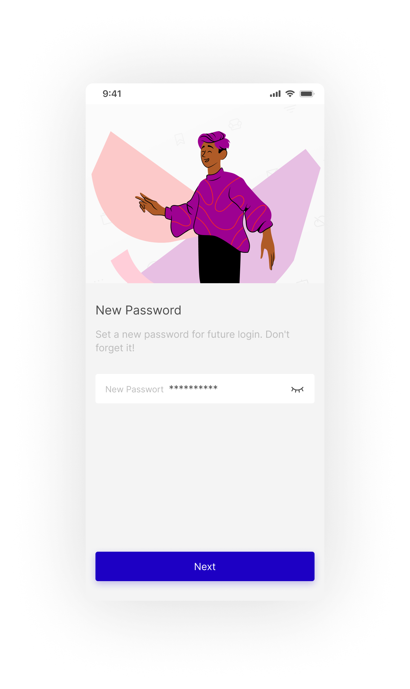
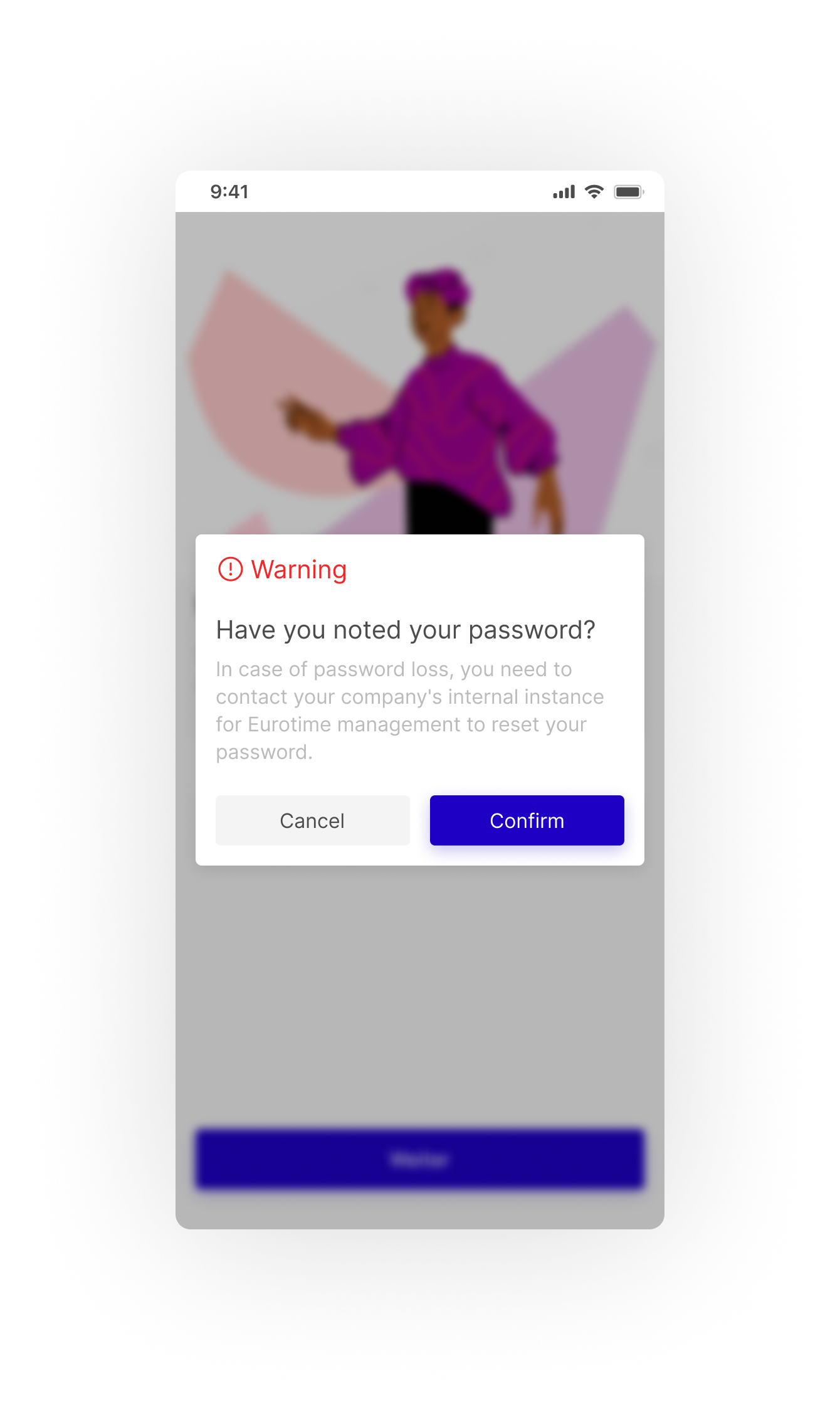
Pushing Pixels...
00
Project Header Image
UI & UX

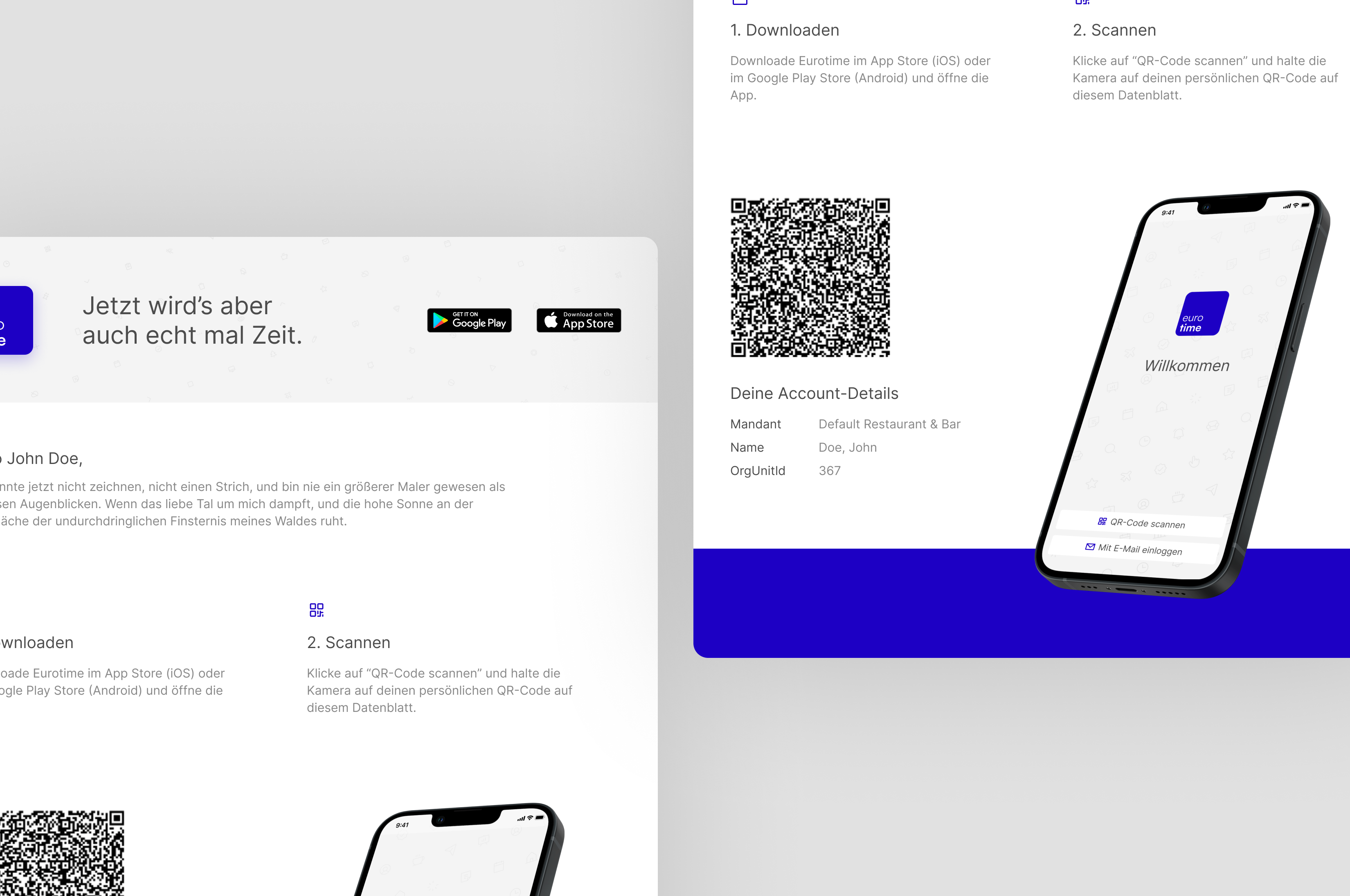
Case: New Login Process for Eurotime

Client Armbruster empiric IT
Year 2023
Responsibility UI & UX
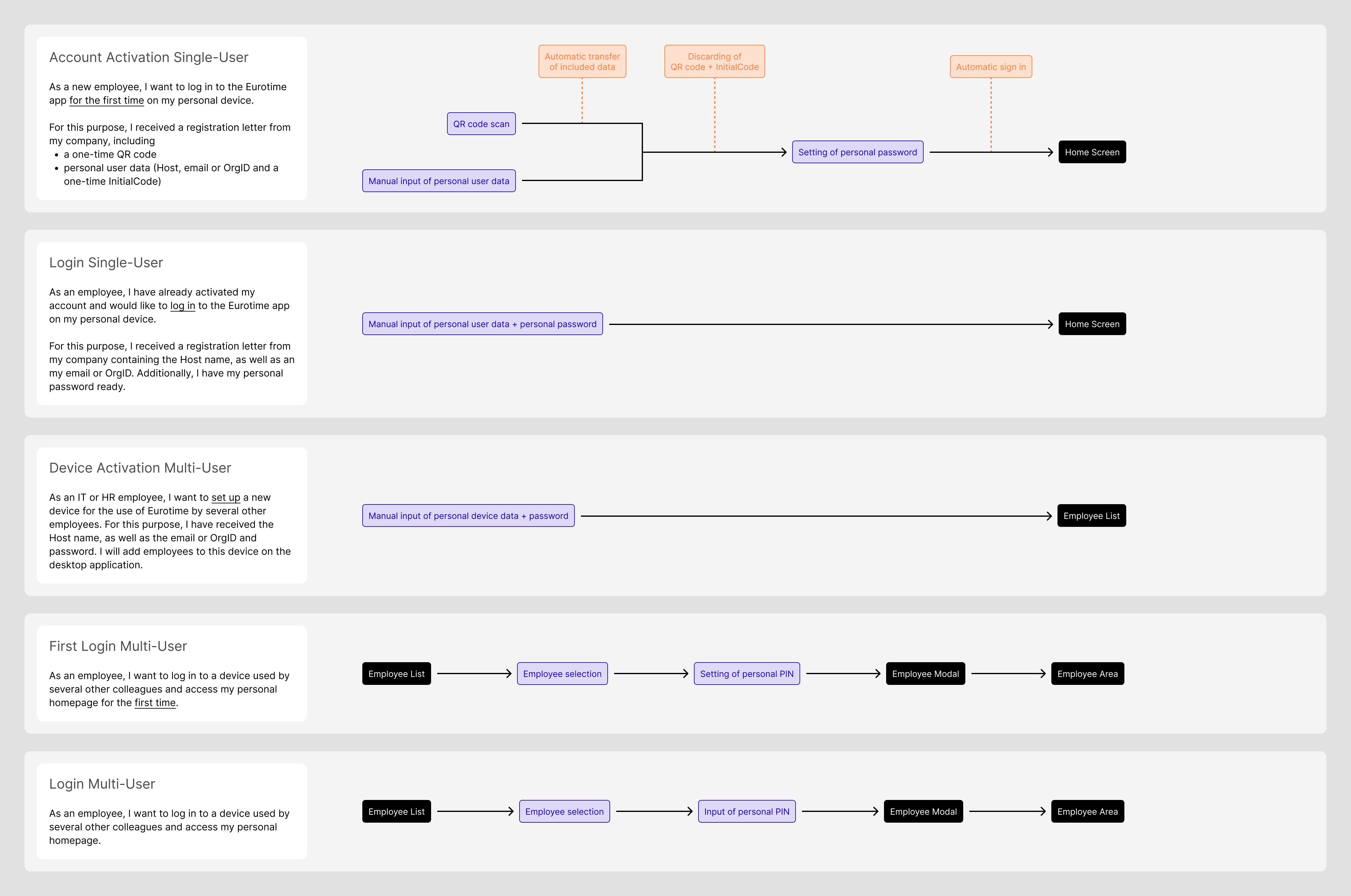
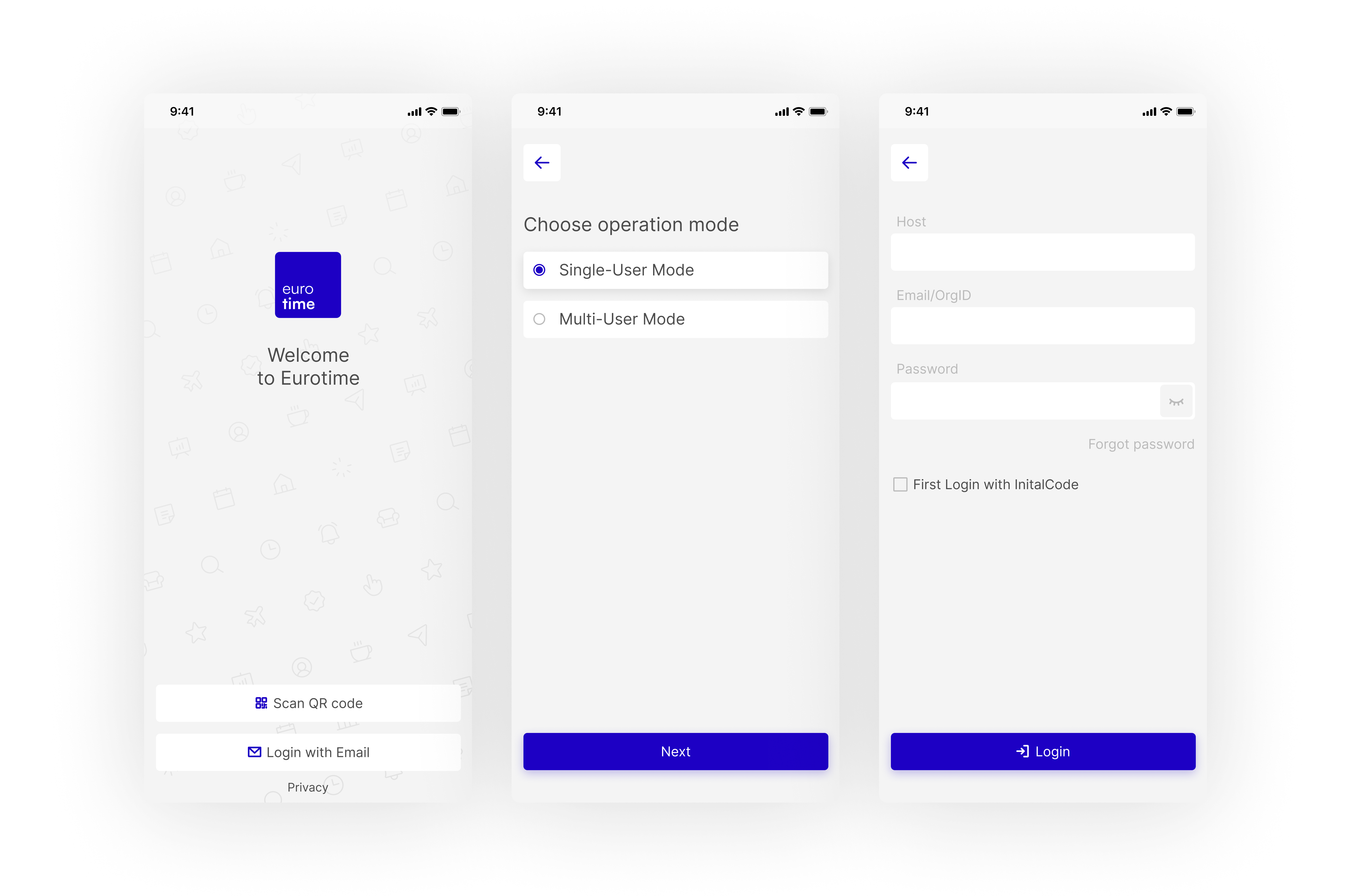
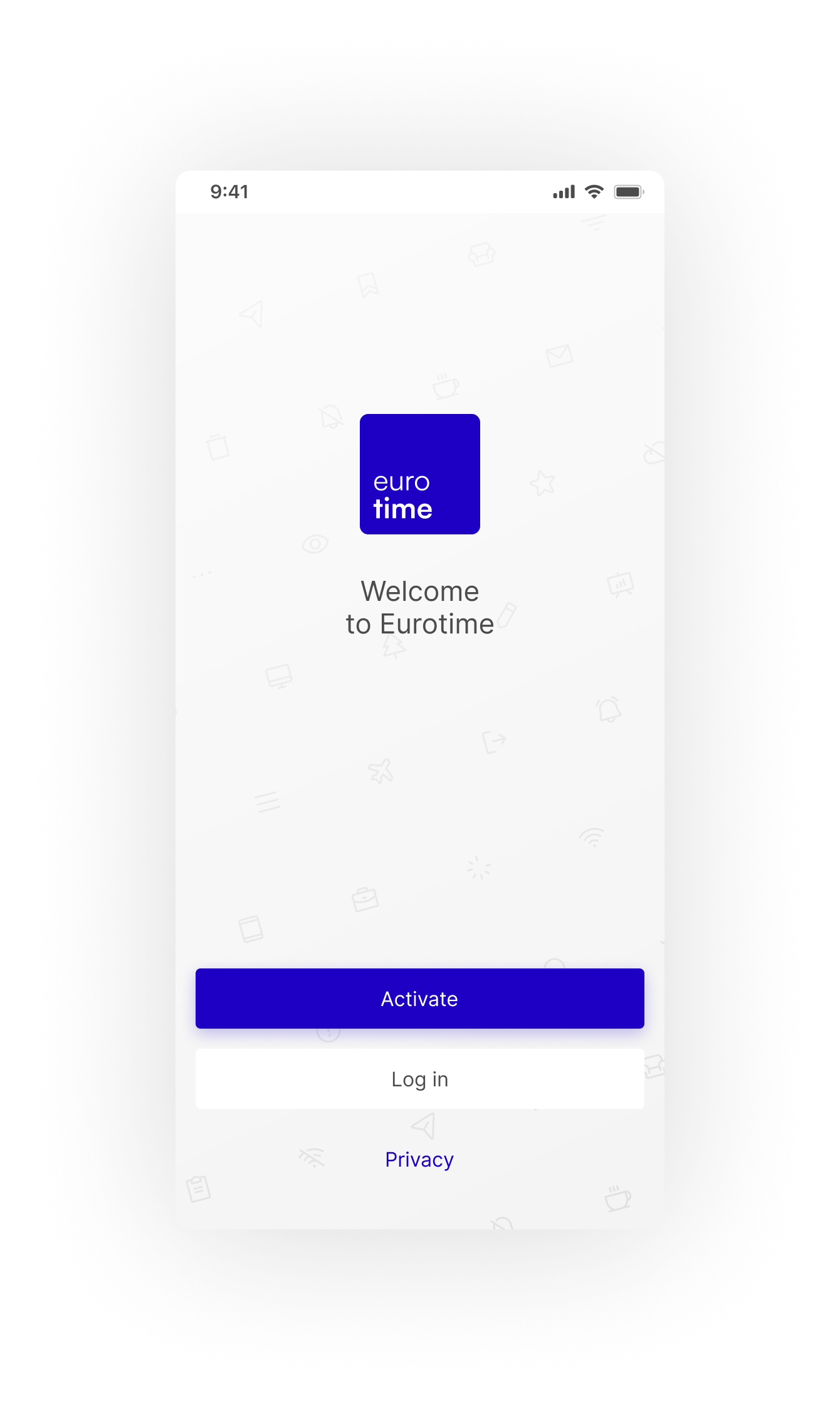
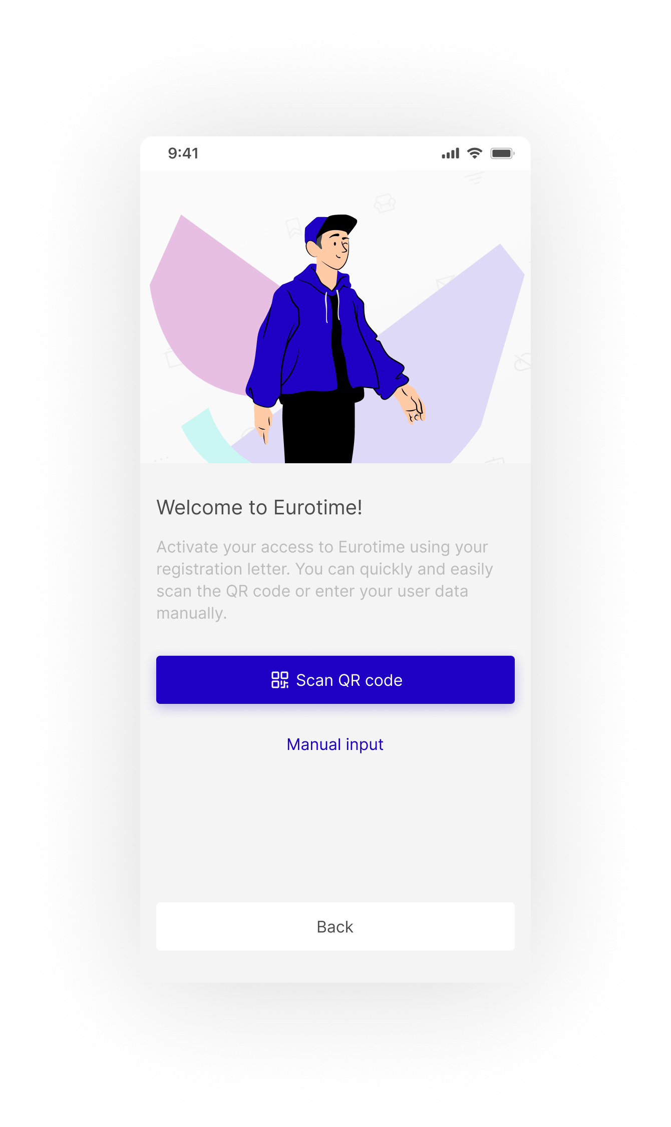
TL,DR: The journey behind my successful proposal of a new login process for Eurotime's employee app. Open the finished prototype here.
Context

Eurotime is an HR management software focused on hospitality, gastronomy and retail. The main software for desktop is accompanied by apps for other devices, most importantly the employee-focused mobile app. It offers functions like time tracking, shift planning and document transfer.

Single Image

You can read more about the app redesign and my buildup of Eurotime's design system here:

The challenge

Eurotime was receiving complaints about their account activation and login process.

Customers expressed confusion and insecurity about whether they were setting up their devices correctly. Eurotime was having to spend time on assistance for a process that should be self-explanatory, diverting resources from more urgent matters.

Notably, the company was working on a new setup of their backend, improving the security of user data storage. Given the intersection of this change with the login section, I proposed a redesign of the whole flow.

Single Image
About the users

The Eurotime app is designed for employees working mainly in the hospitality, gastronomy and retail industries. The user base includes all departments and ranges across all ages and genders. Eurotime is an application solely meant for work purposes and does not offer any functions for personal use.

01

A Concise User Journey Analysis

First, it was important to understand which options for account activation and login were offered by Eurotime. A good summary of user’s needs facilitated a streamlined analysis of existing flows.

Modes

Due to the highly customisable nature of Eurotime, the app offers two distinct setup modes: one for individuals and their personal devices (Single-User Mode) and another for company devices accommodating multiple employees (Multi-User Mode).

Registration letters

For Single-User Mode, activation PDFs are generated by the respective company’s HR or IT department, including login data as well as a QR code containing those. These registration letters are generated per employee.

Single Image
Registration letter for Eurotime's employee app in Single-User Mode
Single-User practice

Under normal circumstances, employees using Single-User Mode would only be required to activate their accounts once and never log in again, as there is no need to log out except for the loss or change of device. There is also no auto-logout function. A loss of their personal password, although not often needed, is therefore at high risk. The resetting of passwords has to be performed through HR, IT or the Eurotime support.

Eurotime themselves expressed a clear preference for the activation of Single-User Accounts via the provided QR code in order to prevent user error and accelerate the activation process. As the QR scan requires access to the device’s camera, some employees opt for the manual input of their data for privacy reasons – this has to be taken into consideration too.

Legacy QR Codes had been used to both activate and login, containing a unique code for each employee. In the course of backend rework, this was changed to a one-time code for activation only, ensuring a higher standard of security.

Multi-User practice

Multi-User Mode works differently: employees are added to the devices via the desktop app by HR or IT. On their first log in to their personal area on a shared device, employees set a PIN which replaces any of their passwords. Only about 5% of Eurotime’s customers use this mode, for which they almost always require Eurotime’s support for setup.

Single Image
Employee list in Multi-User Mode
The resulting interaction flows

Multi-User Logins start from the Employee List and are therefore not considered in the rest of this Case.

Single Image
02

Analysing Existing Screens

The following step entailed a careful review of the current flow. Examining these screens in light of the previously shared negative feedback provided clear insights into the interface's specific weaknesses, guiding the redesign process towards meaningful improvements.

Single Image

The five key weaknesses

1️⃣ Extensive use of unclear terminology

2️⃣ No context or support through tooltips or help text

3️⃣ No clear distinction between account activation and login

4️⃣ Distant communication to user with no introduction

5️⃣ Unnecessary reliance on user decisions

03

Proposing Solutions

Having compiled all the gathered information, the next step was to start iterating on the new design. Following a few rounds, all identified issues were successfully addressed.

The changes followed two main goals: Establishing trust elements within the first contact with the Eurotime app, as well as the creation of intuitive flows with minimal room for user error.

Single Image
A fresh start

With a clear distinction between account activation and login, the first screen now featured the only user choice left in the whole process. Activation was visually prioritised, given the previously established rare case of user login after activation. The interface’s terminology was aligned with the registration letter, ensuring continuity across the user journey.

Streamlining account activation

Prominently featuring the QR code scan, account activation was sped up, in line with the client's preference.

Color me joyful

The introduction of custom illustrations added a friendly tone to the screens, filling them with color and joy.

Single Image
Subtle orientation

In order to offer more guidance and transparency throughout the activation and login processes, short texts were added to each and every screen, as well as clear headlines to provide orientation.

Easy input

For manual activation and login, OrgID was established as the default identifier input, given its maximum length of 5 digits.

Single Image
On the right track

Visual validation was implemented specifically for the Host input, providing encouragement for lower digital literacy users.

Single Image
Focusing on the most important parts

Structurally, the most significant change involved establishing Single-User Mode as the default mode selection and discreetly concealing Multi-User mode for the majority of users. Given that only 5% of customers utilise Multi-User Mode, and its setup necessitates IT support, compelling 95% of users to choose was nonsensical. The removal of this step notably accelerated the login process. To emphasise the infrequency of Multi-User Mode usage, a renaming was proposed, transitioning from Single- and Multi-User to Standard and Device Mode.

Single Image
Minimising future frustrations

Having identified a high risk of password loss, a special warning concludes the activation process to further decrease user error.

Single Image
From Sie to Du

Lastly, a linguistic adjustment from honorific to plain speech in the German language aimed to create a friendlier and more accessible tone of communication.

The best way to present my redesign proposal was to create a clickable prototype, which you can access right here. Please note that it is in German only. You can chose between Light and Dark Mode in the upper left corner.

04

The Impact

Backed by comprehensive analysis and a tangible prototype, Eurotime was immediately won over by my proposal for a new login process.

In the following week development handoff was prepared, concluding the design efforts for this redesign within 1.5 months.

ABOUT THE CLIENT

Eurotime is an HR management software focused on hospitality, gastronomy and retail.