Pushing Pixels...
00
Project Header Image
UR & UX

Case: New IA for SENEC’s Monitoring Portal

Client SENEC
Year 2022-2023
Responsibility UR & UX
TL,DR: Fundamental restructuring of SENEC’s complex system monitoring portal for partner companies and technical support, featuring discovery, user research and the creation of a new information architecture.
How we got here

SENEC’s monitoring portal had grown organically for too long, resulting in a complex and overwhelming structure that impeded efficient workflows.

The legacy portal and its problems

Users of the portal, SENEC’s specialised partner companies like installers and distributors, as well as their own technical support were confronted with a product that had not been intentionally designed, their needs and behaviour neither researched nor considered in the interface.

A new portal concept

SENEC decided to build a new portal from scratch, restructuring what was already there and adding new services and features. The new platform was extensive, including support ticketing, help center, certification academy and many other services. Most importantly, the portal served as a monitoring tool for client systems.

My responsibilities

As the lead designer for system monitoring, my main area of work was the energy system page. Each page contained all available system data, as well as features for error handling, analysis and maintenance.

Composition of energy systems

Systems are composed of multiple components, such as the storage unit, inverter, batteries, etc. as well as optional elements, like wallboxes and immersion heaters. Additionally, software packages could be purchased to upgrade systems and their features.

The challenge

The legacy portal's system pages were badly disorganised.

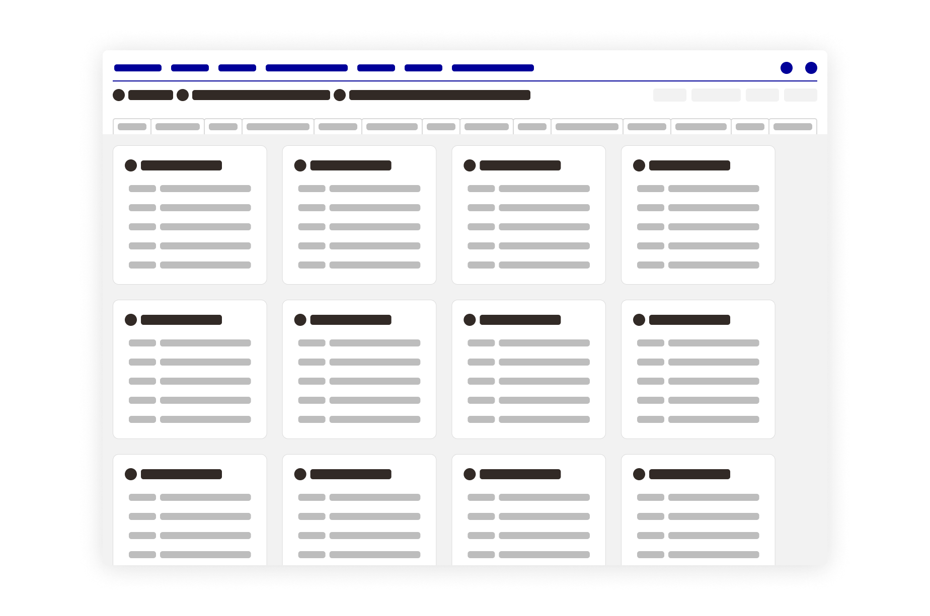
System pages were organised with tabs. An overview tab featured numerous widgets for base data, component data and status, software packages and widgets for tagging and note-taking. An array of additional tabs were filled with component settings, documents, charts, graphs, lists and more, sometimes using a second tab navigation to further separate information. Data and settings were scattered across tabs and widgets, creating an unintuitive navigation experience relying on trial and error.

To further complicate this challenge, no two system pages looked alike: as clients’ energy systems differed in their composition and setup, so did their widgets and tabs. The dynamic system page construction lead to ever-changing layouts with no widgets or tabs at the same position on two respective system pages.

Single Image

Getting an overview of a system’s composition at a glance was impossible, requiring users to scan pages over and over again, losing precious time and energy.

Discovery & Research

Close collaboration with SENEC’s technical support team was a key factor in this process, given their extensive knowledge of existing systems and experience with handling the portal. Discovery sessions helped understand their needs and were held regularly.

Single Image

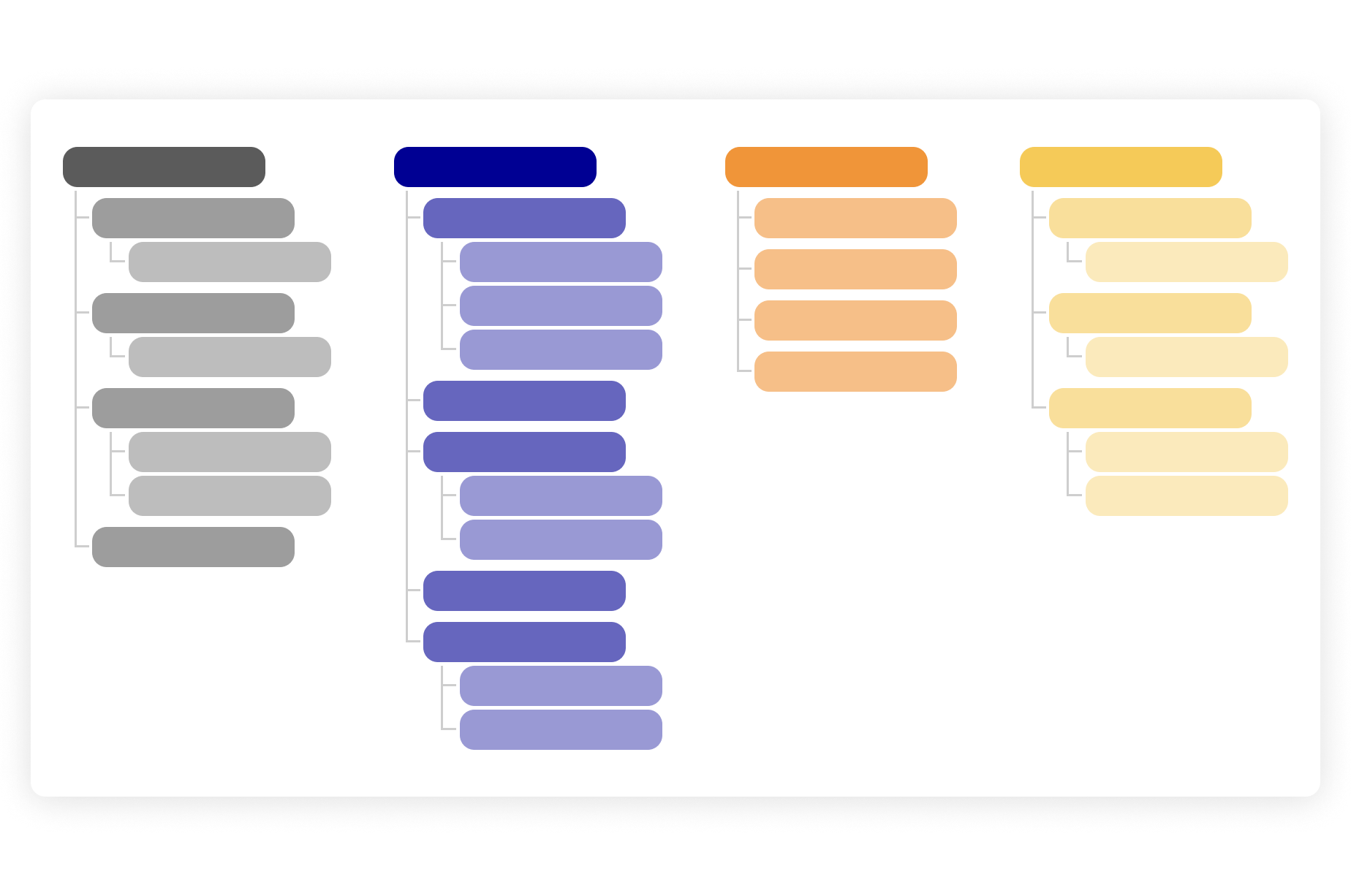
In order to create a new comprehensive information architecture, dozens of pages were analysed. All existent data, widgets and functions were compiled, covering every possible edge case. With this done, a card sorting session with technical support staff gave important insight into hierarchy and logical order of data. These findings were later validated in interviews with installers using an interactive navigation prototype.

An ideal structure for system pages

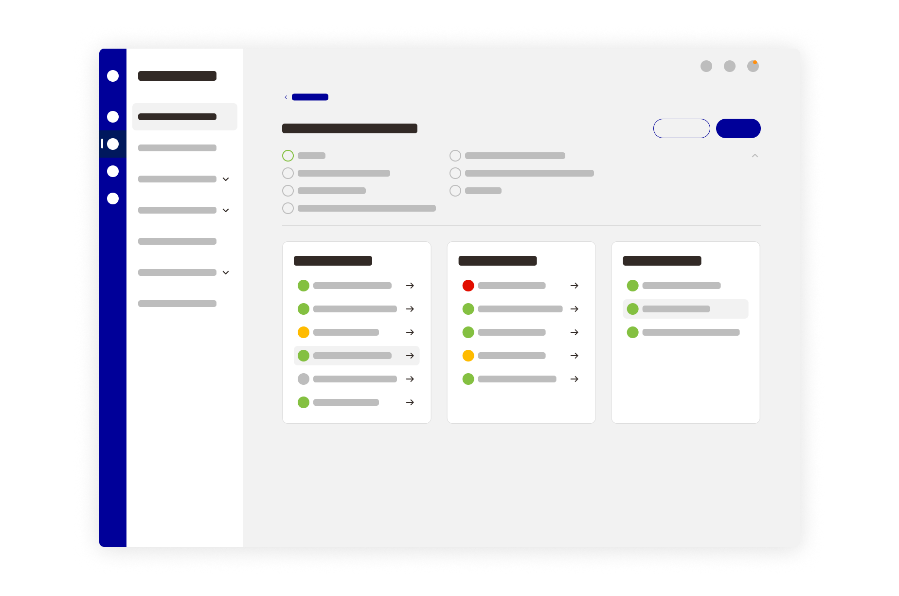
Sidebar Navigation

🟢 Scalable & scanable
🟢 Clear visual hierarchy
🟢 7 First level navigation items
🟢 Professional impression

Fixed Top Bar

🟢 System identifiers for orientation
🟢 Crucial information at a glance
🟢 Copy to Clipboard on click
🟢 Meta functions (e.g. add to favorites)

Dashboard

Features simple lists of components, interfaces and software packages, as well as their respective status, enabling users to see the system's composition and state at a glance. Each list item has a fixed position – non-existent elements are greyed-out. Clicking on items leads to a detailed section.

Components & Interfaces

Components are displayed in detailed sections, consolidating related data, charts, error messages, and options for editing and maintenance in a unified location. All component sections are compiled on one page, easily accessible through anchor points in the side bar. Interfaces are treated the same with their own page.

Single Image

Establishing consistent layouts across system pages with a new logical structure lead to an optimised usage of available space, advanced scanability and minimised number of clicks required for frequent tasks. Both user groups praised the simplicity and intuitive structure of the new system pages, expecting a strong increase in the efficiency of maintenance tasks and error handling after implementation.

ABOUT THE CLIENT

Founded in 2009 in Leipzig, SENEC is among the leading providers of energy and storage solutions in decentralized power supply. The company is a subsidiary of Energie Baden-Württemberg AG (EnBW), one of the largest energy supply companies in Germany and Europe.